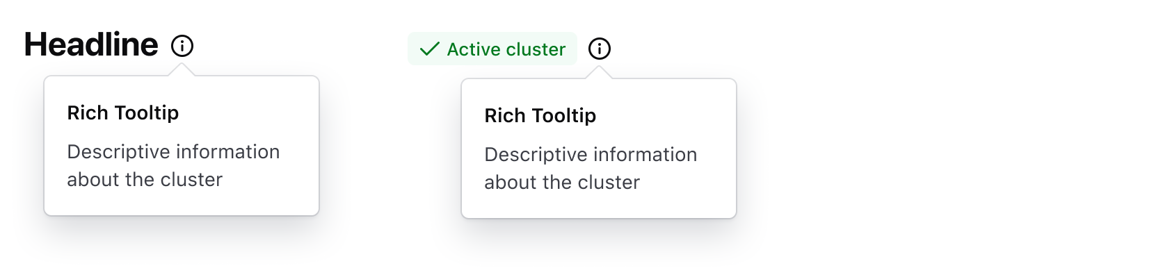
A Rich Tooltip displays extra supplemental information about a UI element. It's similar to the "standard" Tooltip but is intended to be used for more complex or structured content instead of simple text. More details are outlined in Rich Tooltip vs. Tooltip.
Usage
When to use
- For adding extra information, in the form of structured content, to a UI element.
- When it’s necessary to temporarily persist extra information in the UI; e.g., if the user benefits from cross-referencing information in the component with other elements in the UI.
When not to use
- For extra information that consists of basic text, consider using the Tooltip instead.
- For complex functions that change or alter the UI, consider a Dropdown instead.
- As a double-confirmation for destructive actions, use a Modal instead.
- If the information is essential to the user completing a task, consider placing this information within the page and associated with a specific UI element.
Rich Tooltip vs. Tooltip
While there is overlap with the Tooltip, the majority of use cases can be categorized one of two ways:
- Tooltip: simple, text-based content supporting basic formatting (italic, bold,
monospace, etc). - Rich Tooltip: relatively more complex, supporting temporary persistence and structured content, links, micro-interactions, diagrams, etc
View more detailed examples of the content the Rich Tooltip could contain in the content section.
Placement
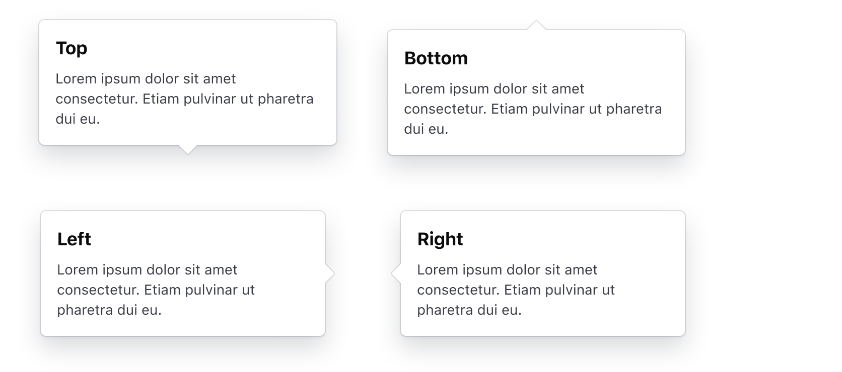
A Rich Tooltip can be placed in various positions relative to the UI element it is associated with.
The most common options are: top, bottom, left, right.
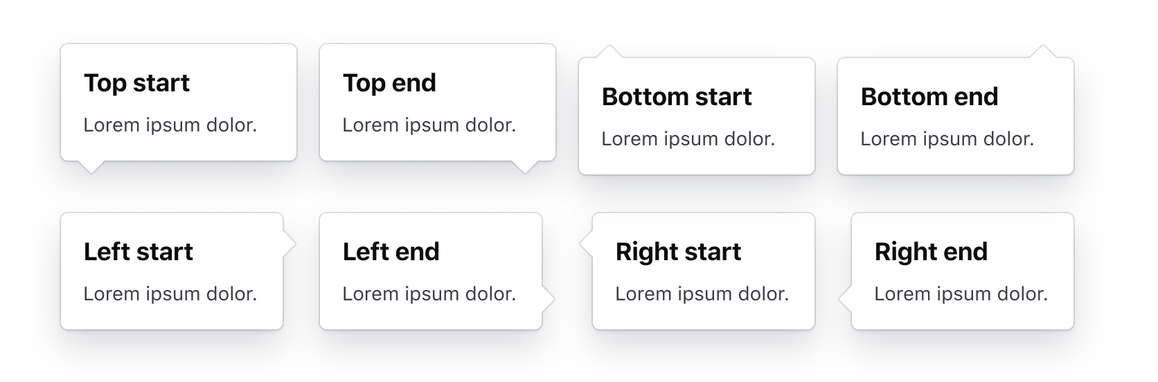
The Rich Tooltip supports additional placement options: top-start, top-end, bottom-start, bottom-end, left-start, left-end, right-start,and right-end.
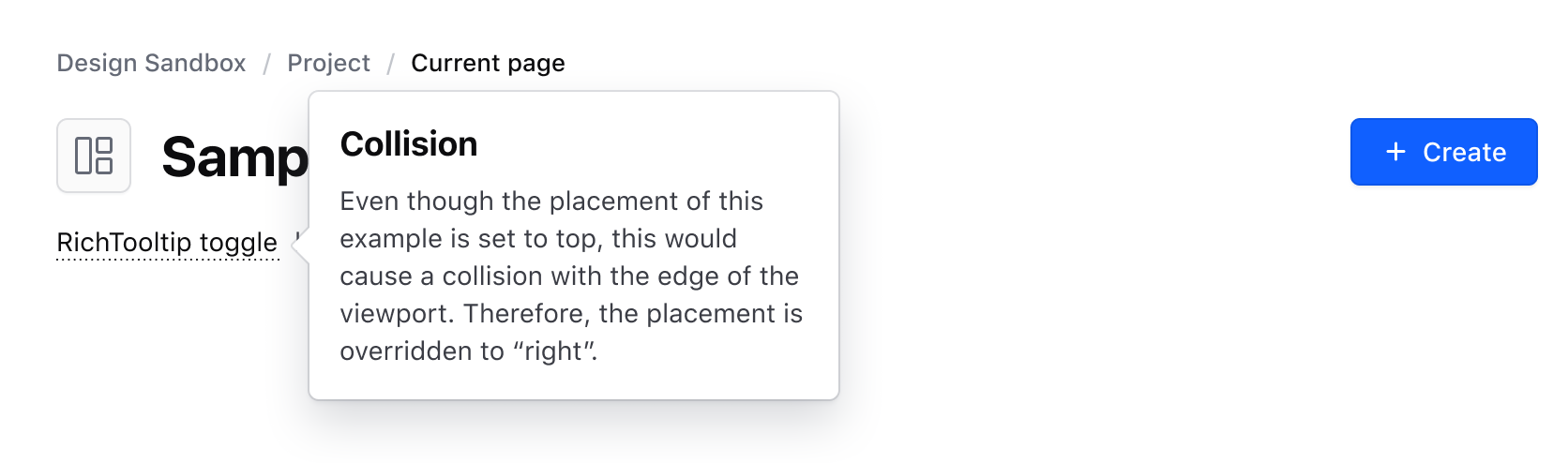
Collision detection
The Rich Tooltip supports collision detection, meaning the placement property might be overridden depending on the position of the component relative to the edge of the viewport. This ensures that the component doesn't extend outside of the viewport while still being associated with the toggle element.
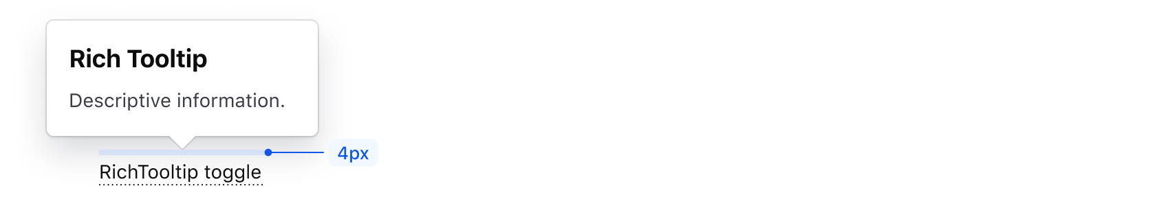
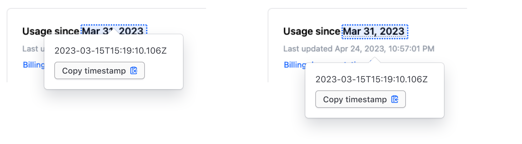
Offset
The default recommended distance between the toggle and the Rich Tooltip pointer is 4px.
Don’t add extra offset if the Rich Tooltip would block important information, appear disconnected from the element it is meant to provide information for, or cause confusion for the user.
Interaction
The Rich Tooltip supports two interaction methods: a On hover / On focus ("soft") interaction and a On click interaction. Which one to use depends on:
- The type and complexity of content displayed by the component.
- Whether temporarily persisting the content in the UI is necessary or beneficial to the user.
Independent of which interaction is used, the Rich Tooltip can be dismissed by clicking outside of the component or with the ESC key.
Toggle
Default
By default, we provide a Toggle component which should be used in the majority of cases along with the Rich Tooltip. This component ensures that the toggle is perceivable, visually consistent, and can be used inline with other content or standalone as part of the layout flow.
How to use
Consider these guidelines when using the default Toggle component:
When used in a block of text, use the "text only"/"no icon" variant, as the icon can unnecessarily break the reading flow of the content.
When using the "icon only" variant, ensure the component is paired with other textual elements (like a headline) or elements described by the Rich Tooltip. Don’t use it in isolation or on its own.
Size
The Toggle is available in small, medium, and large sizes in both the Ember and Figma components. If used in a paragraph of text, the Ember component will inherit the size from the surrounding text.

Icon
An icon can be used in the Toggle in either the leading or trailing position, or on its own when paired with another element as a label.
Underline
Only available as a component in Figma, the ToggleUnderline component can be used inline a block of text like a paragraph.
Custom toggle
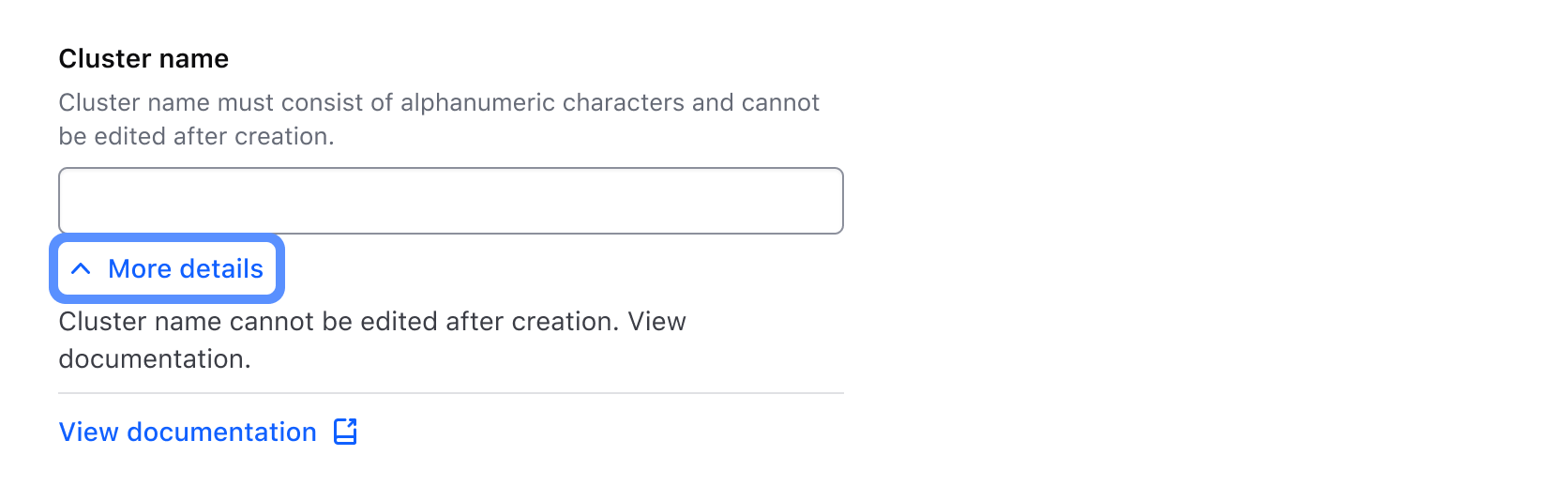
If absolutely necessary, toggling the Rich Tooltip using a custom element is supported but should be used sparingly and conform to the following usability and accessibility success criteria:
- Must have a minimum target area of 24x24 pixels.
- Must have a minimum contrast ratio between the background/surface color of 3:1.
- Should use actionable language or be paired with a label to communicate that additional context is hidden from the user.
More information about this success criteria can be found in the accessibility section.
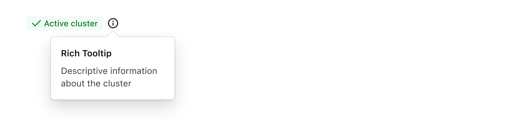
Don’t use a Badge or BadgeCount as the toggle for the Rich Tooltip, Badges are intentionally non-interactive elements and don't visually communicate that content is hidden behind a hover, click, or focus interaction.
Instead, place the Toggle component inline with the Badge to communicate the existence of a Rich Tooltip.
Don’t toggle a Rich Tooltip from a form element like a Text Input, Select, Textarea, or form primitive like a Label or HelperText.
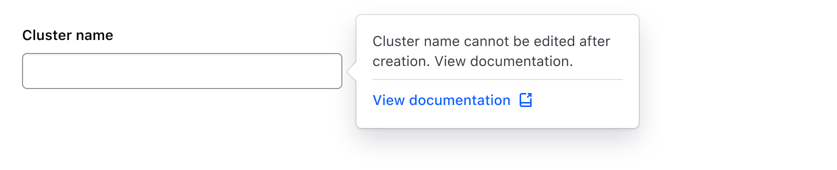
The following example using HelperText will not be read out as interactive to users with screen readers, only the text will be read. More details on this recommendation can be found in the Helper Text documentation.
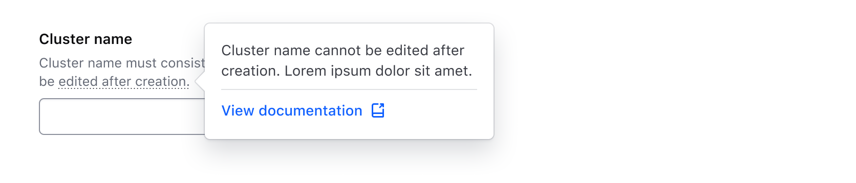
Instead, include additional details in a Reveal.
Content
The Rich Tooltip is built to be flexible enough to support a variety of use cases and content. Consider these common examples when determining whether it's appropriate for your use case.
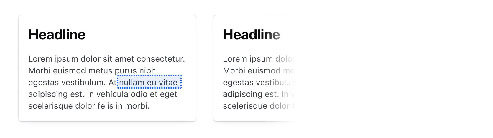
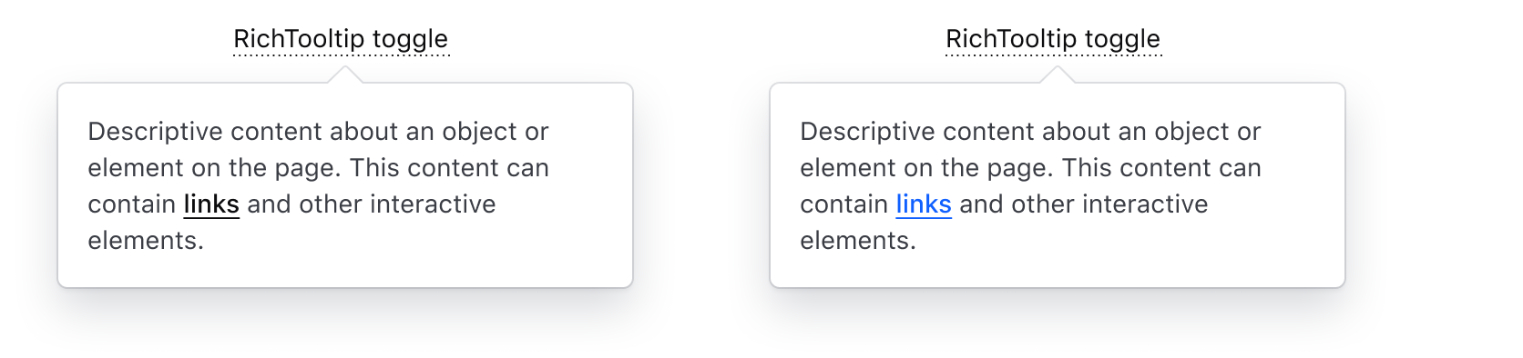
Text with links
This is a common use case for a Rich Tooltip due to the lack of support for interactive content in the Tooltip.
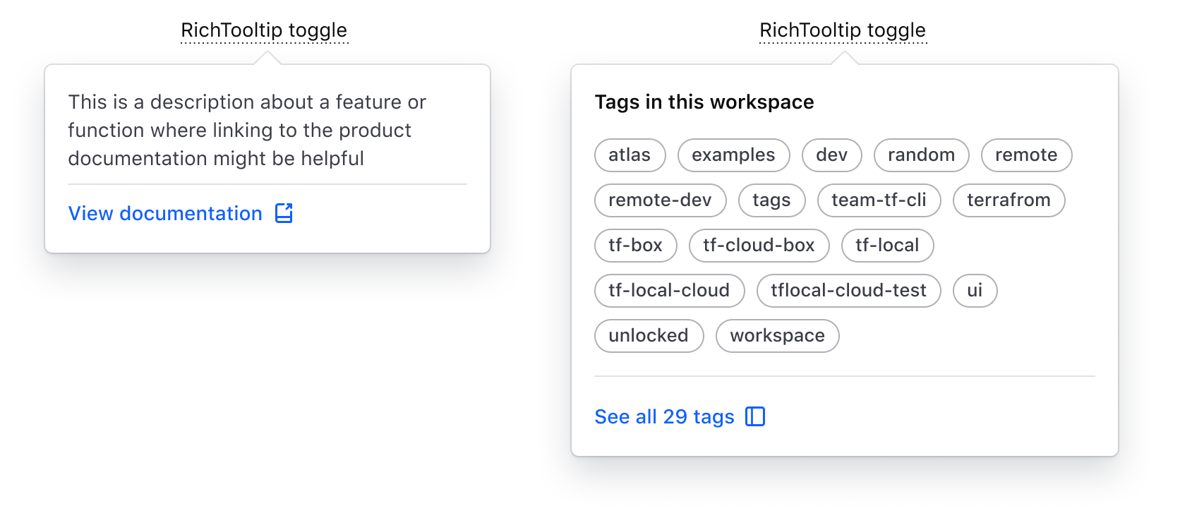
Structured content
Compared to the "standard" Tooltip, the Rich Tooltip supports more structure and layout methods to better organize the content hierarchically.
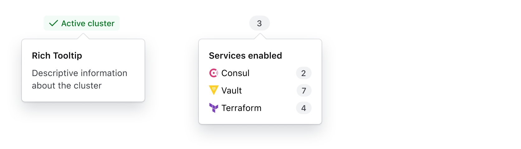
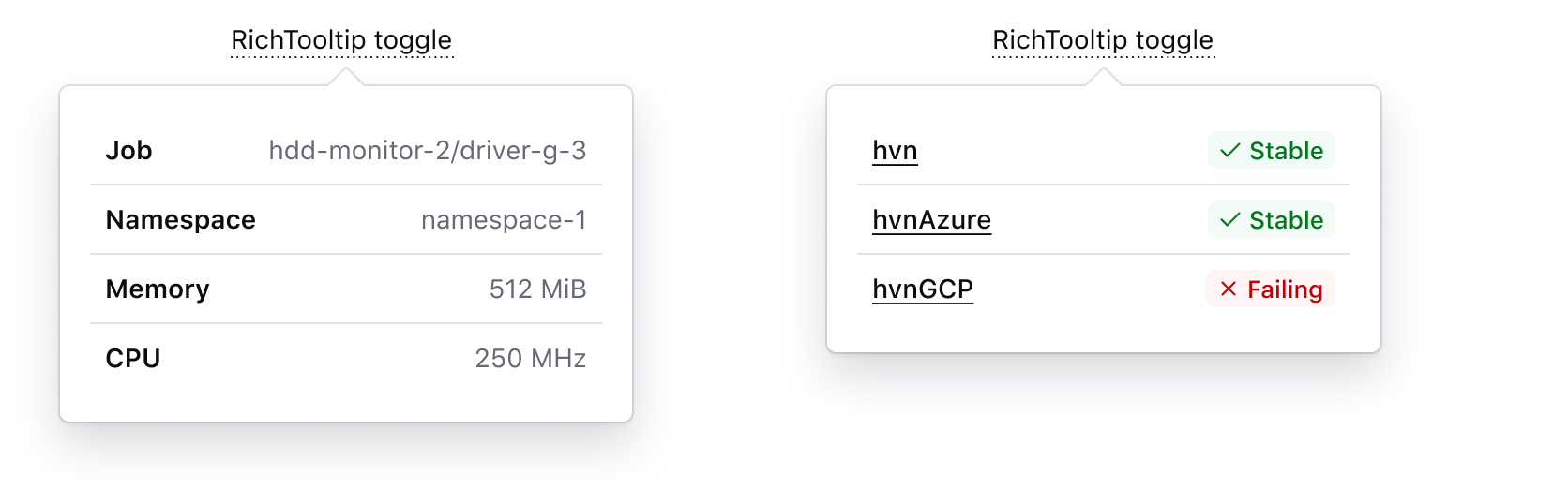
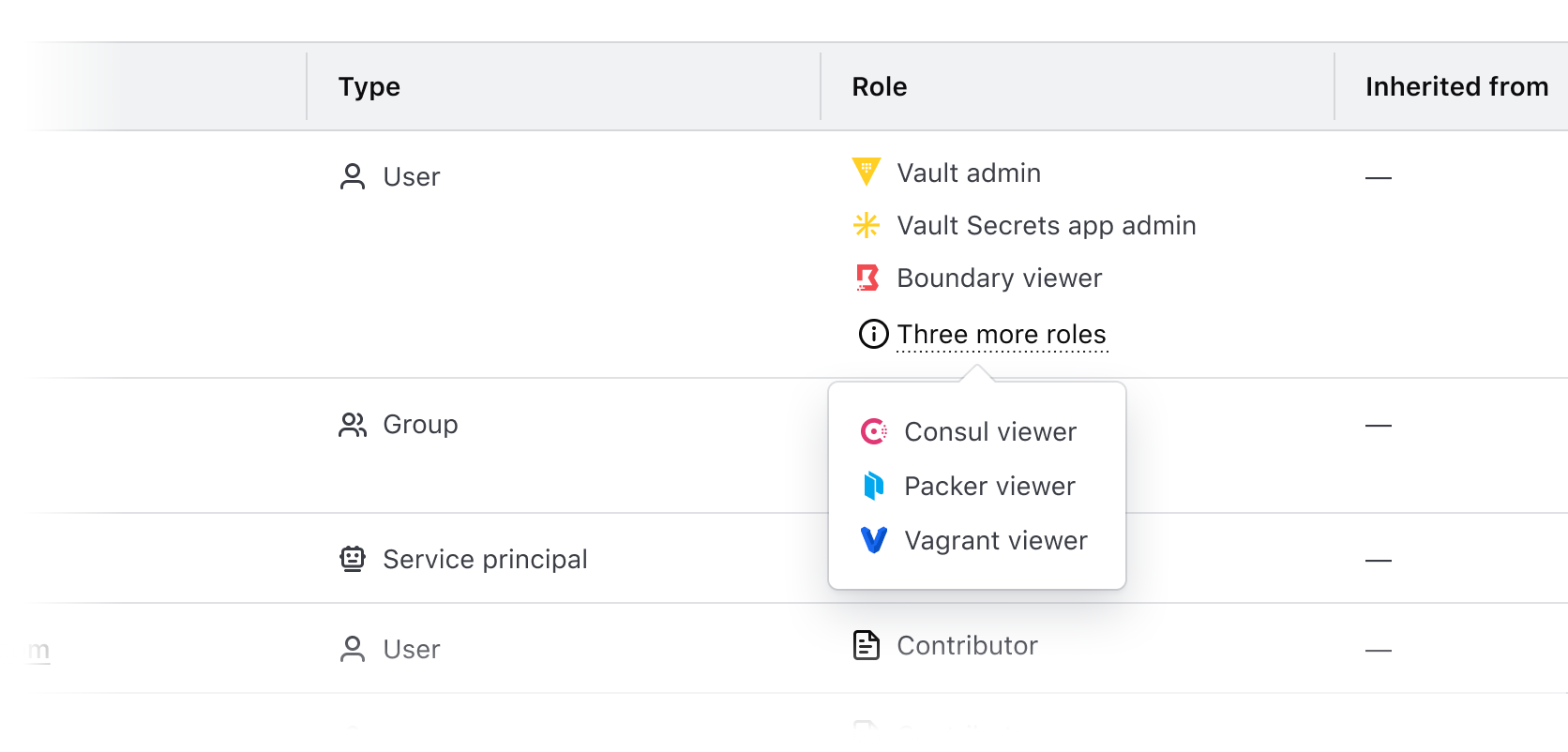
Key-value pairs
Use the Rich Tooltip to display supplemental key-value pairs or metadata related to an element.
Overflow content
The Rich Tooltip component associates a toggle element with a tooltip element that contains generic content. "Soft" (hover/focus) or click event listeners can be assigned to the toggle, which toggle the tooltip's visibility, which appears as a popover on top of the page content. The tooltip can be closed by re-triggering the toggle events, clicking outside the popover, or pressing the esc key.
While the Rich Tooltip may seem to be a fairly simple component, there is a lot of complexity beneath the surface:
- The component uses the native web Popover API to display the tooltip content as a popover on top of the page.
- A third-party library called Floating UI provides the anchoring of the "popover" to the "toggle" element and the automatic positioning/collision detection functionality.
- These functionalities are abstracted into two HDS utilities (the
hds-anchored-positionmodifier and the PopoverPrimitive component), which the Rich Tooltip component is built on top of.
As tooltips are notoriously difficult to implement in an accessible way, we have intentionally limited some of the ways in which the Rich Tooltip can be used, while at the same time providing an alternative if some edge cases need to be supported (but in this case, consumers will need to make sure the component is used in a conformant and accessible way).
The component provides several options to customize its behavior. Below we have tried to describe the most common examples, but if you find a use case that is not supported by the existing Rich Tooltip implementation, please speak with the Design System team.
How to use this component
When using this component, there are a few things to consider:
- what toggle to use; the standard toggle or a generic toggle
- if the toggle is a standalone element or instead lives inline with other text
- how the end-user should interact with the toggle to show/hide the tooltip
Depending on these factors, there are different ways to implement the code, as described in the alternatives below.
Standard toggle
The standard Toggle element ensures perceivability and accessibility out of the box. It consist of a piece of text (with an underline decoration applied to it) and an optional icon. The icon can be leading or trailing, and its size is always proportional to the font size of the text (1em).
The text and icon are rendered inside an HTML <button> element (which technically acts as a toggling control for the popover). For details about how the user can interact with this button, see the Interactivity sub-section.
The Bubble element is a pure container that yields the children inside the "popover" tooltip bubble. Consumers can pass whatever content they need to it, but they are responsible for styling and structuring it according to their needs/context.
As a standalone element
By default, the Toggle element is rendered as a block. This means it can easily be used as a standalone UI element.
As mentioned above, the invocation requires a "toggle" and a "bubble" element to be passed as yielded sub-components. The "toggle" accepts a @text argument and an optional @icon argument. The "bubble" element instead yields its content inside the popover tooltip: